

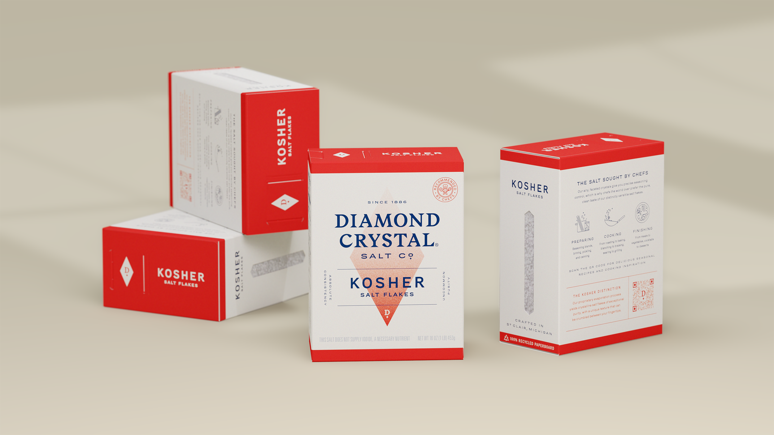
The Salt Sought by Chefs
Diamond Crystal’s Kosher salt has long been the gold standard of the culinary world—from the classrooms in culinary school to the most notable restaurants in the world. The DC team recognized that there was a significant opportunity to build a new foundation for the brand that could better speak to the passionate audience around the product, but needed help in identifying how to best communicate in ways that resonated.

Despite the following behind the product, the previous brand and packaging (left) was stagnant and diluted—sharing the same industrial look and feel with non-edible salts from sister brands. The large scale of the box was also poorly suited for use by home chefs.
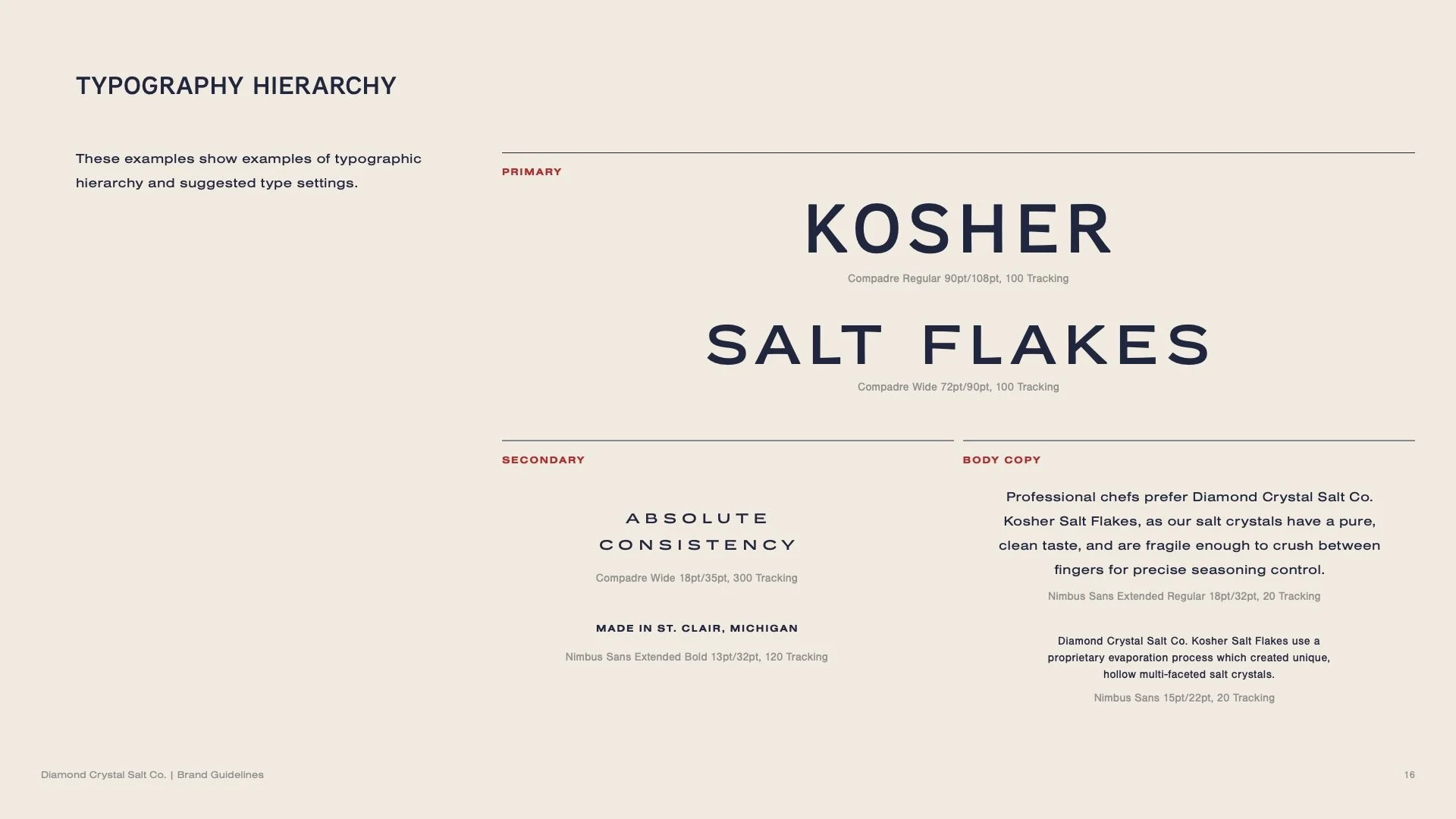
To better understand the space and target audience, our team conducted rigorous user research and audits (visual and ergonomic) of products in (and adjacent to) our category. Synthesis of this data brought the target audience into focus and tactical explorations of hierarchy and messaging informed how we spoke to them.
Aspiring home chefs are empowed to elevate their own craft and build connections with the rich history of the brand through better understanding of the attributes, benefits, and how to leverage the superior performance of the products.

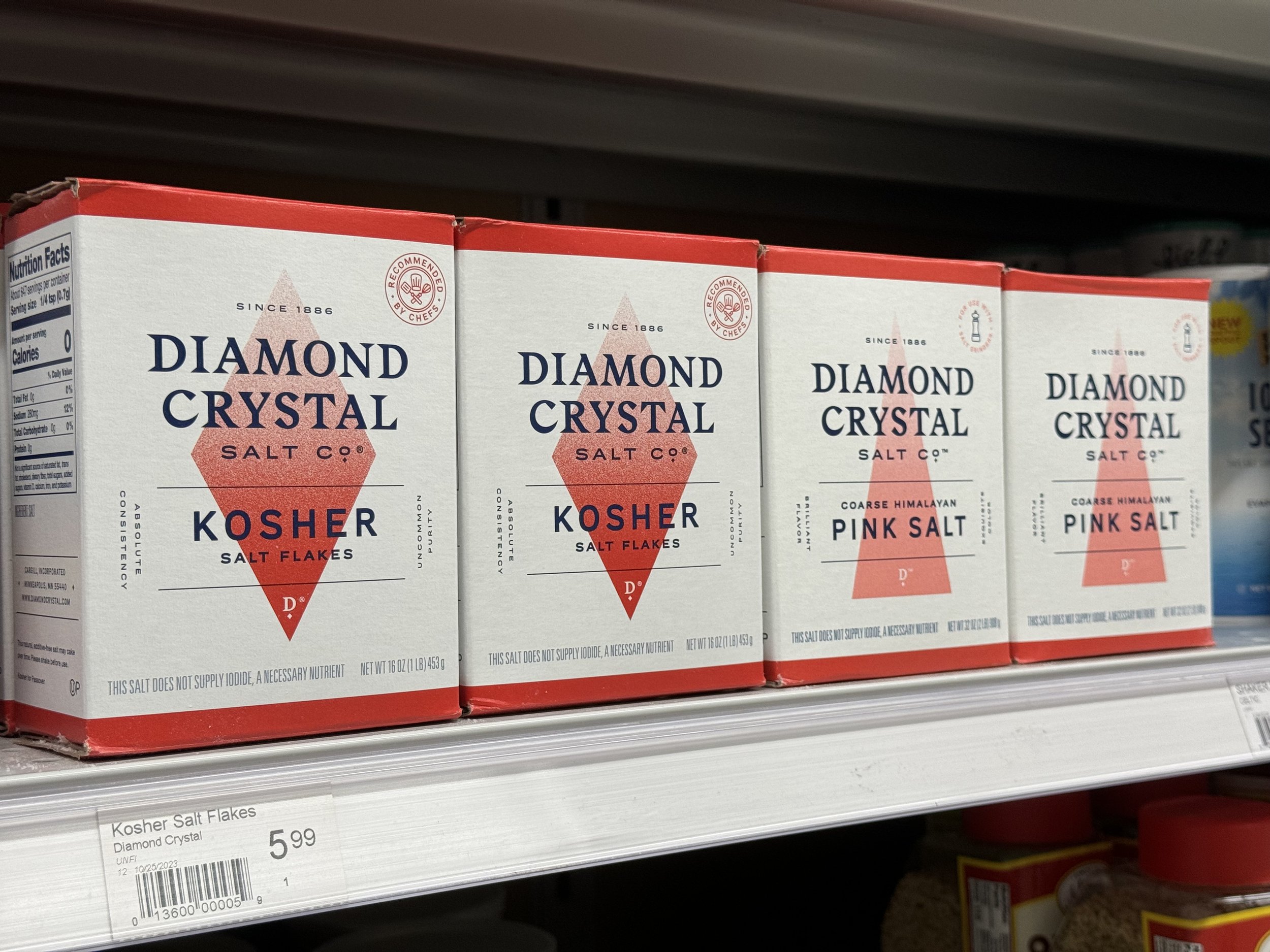
To differentiate between the parent brand and an expanded family of products, we moved away from the historic “big red box.” Leveraging the brand equity, red was carried forward as a brand blocking element uniting products across the family on the shelf, while the different salt types are presented visually with tailored color and geometric forms, opening up a more flexible, scalable system.
With a confident, thoughtful, and refined new design language and differentiated name, the entire food salt portfolio now has a consistent yet flexible design system to better pair with the beloved product inside the box.


Project Team
Miri Chan, Mega Tjhin, Sarah Polansky, Sebastian Fraye, Brent Stickels, John Eagle, David Summers, Kieran Moriarty, John Nam, Carly Kim, Amie Gutierrez
Created at Enlisted